One of the more uncomfortable truths about digital humanities—indeed, likely one of the reasons for resistance to digital humanities among traditional scholars—is that design matters. Those of us who have chosen the life of the mind like to think that ideas and insights will find an audience and make an impact regardless of such superficial things as the vehicle those ideas and insights are communicated through. Design also smacks of marketing, which most professors consider unseemly.
But good design for a website, service, or tool means, as Roy Rosenzweig and I put it in Digital History, that your resource will be useful and used. Useful because your resource will be structured in such a way that a user will be able to fully explore and learn from it; used because the user will be drawn into the resource and highlight its existence to others.
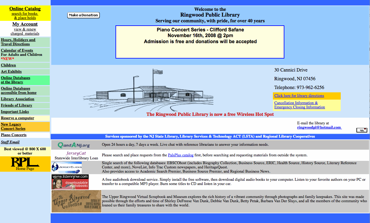
Case in point: Here is the website of the Ringwood (New Jersey) Public Library:

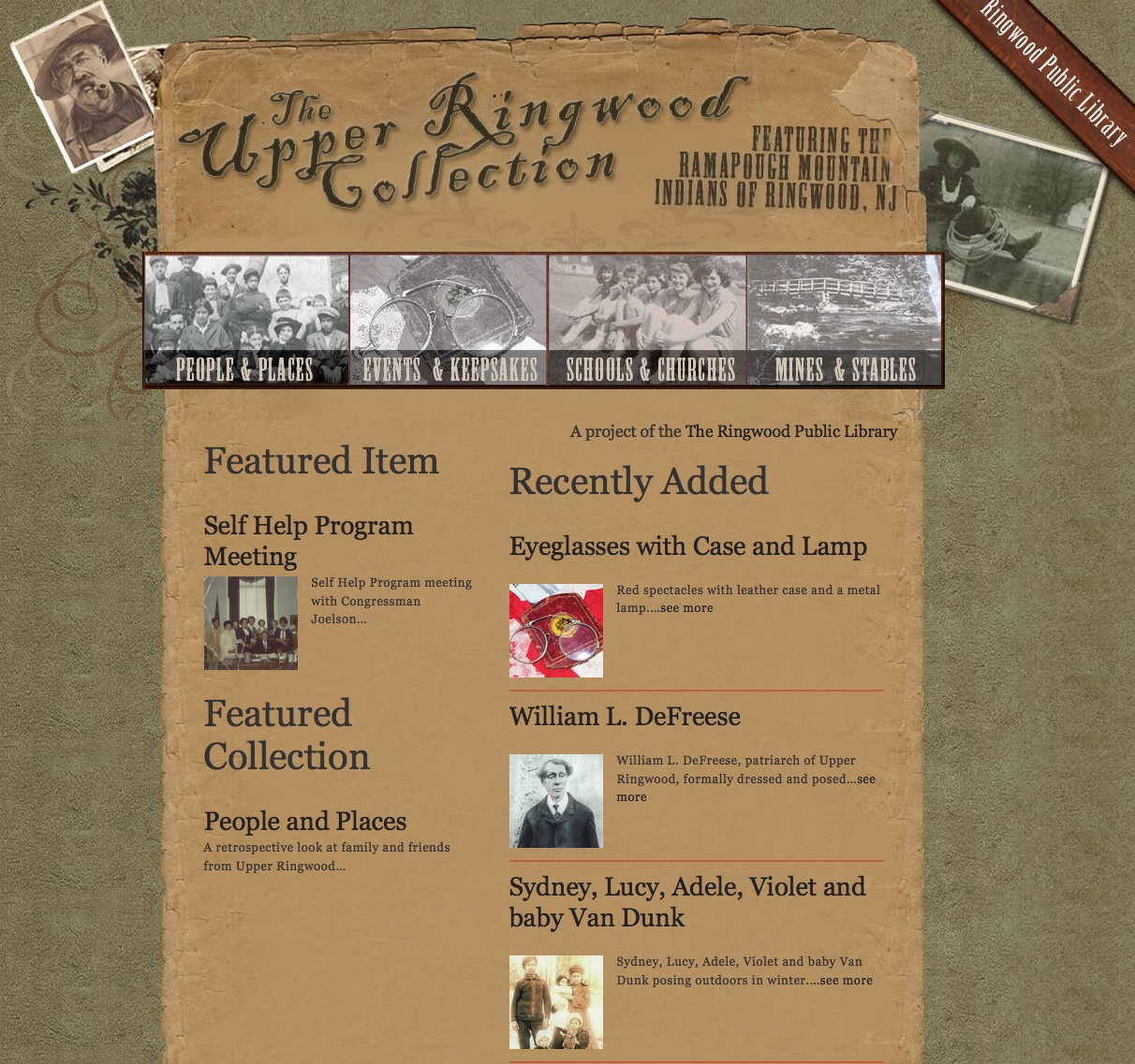
A not atypical website for a local public library. And here is the Ringwood Public Library’s site about the history of Upper Ringwood:

The latter is powered by Omeka. Which of these would you rather spend time with?
Comments
You make a good point, Dan. The relationship between design and a digital humanities project is the same as the relationship between literary style and writing. Some scholars never trouble themselves to write good, stylish prose because they are concerned only to set down their ideas. Actually, the way something is written affects what is written.
[…] — go ahead and look through examples in our showcase page to get some ideas. Dan Cohen had a great post about the Ringwood Library’s use of Omeka, and I see this as only the […]
This is really great advice, Dan. I’ll pass this along to my digital history graduate students.
Meanwhile, we had an interesting discussion of collecting sites last evening. We wondered if anyone is doing something on the 2008 election (yes, there is Change.gov but that is controlled by the President elect). Thoughts?
@Lincoln: That’s a nice parallel, Lincoln. Perhaps web design is indeed the new prose; both can hide good scholarship by being too opaque.
@Knitting Clio: Funny you mention collecting the 2008 election; we’ve been discussing that at CHNM as well. I believe the Library of Congress is doing their normal website caching in partnership with the Internet Archive. And amazingly, Obama beat us to the “Tell Your Story” version of online collecting, by adding that feature to the home page of change.gov.
[…] lényege, hogy a fontos és hasznos információhoz és tudáshoz hasznosan férhessünk hozzá. Dan Cohen hozott két képernyőképet, hasonlítsuk […]
The second! 🙂 (It had to be said.)
But seriously, I’m so happy that digital humanities (spurred by you) does indeed seem to be taking design more into account. I’m thinking seriously of going back to school in human-computer interaction just so that I can get a good grounding in interface design principles and technologies, then dedicating myself to cleaning up digital library and digital humanities project interfaces.
For most users, the interface *is* the content, just as for most readers (as Lincoln points out), the prose *is* the ideas. I couldn’t explain any better why it is that swerving into interface design seems entirely logical for this English Ph.D. with years of experience teaching (or trying to teach) writing.
I will say, too, that I’m kind of a usability testing addict, and it has occurred to me more than once that there ought to be a similar observation-based way of testing the “usability” of writing. Hapless academic web site builders are often startled and appalled by seeing how difficult and unpleasant they’ve made it for users to navigate their web sites; if writers could only spy upon their readers in the same way, we might get some real breakthroughs in composition studies.
That’s good to know that a neutral party is collecting this information. I’m wondering what change.gov will do with the stories they collect — will they post the unflattering ones (or the really hateful ones)?
I am sorry, but I prefer the first. At least I am not ready to let it go. Though the old-fashioned HTML is a bit unsightly, it is solid with a transparency that is trustworthy. I feel as though the site was made and maintained by the library staff, and not a freelance web designer. There is a humility present in the gifs, tables and understated layout of the older library website. One gets a feeling for the character of library and its goings on.
The Omeka powered site, though slick, has a very impersonal feeling to it. As though it was designed to be used by used by any institution. It is visually attractive, but it feels a little too slick like it is selling a movie. Where the old library site feels like a 19th century downtown, the Omeka site seems more like the strip where the newest big box store is hawking chinese made goods. Don’t get me wrong, the photos themselves have true value, they are meant to be looked at — and all users should appreciate that they are here preserved. But why are they tagged with such silly descriptors as “earring” and “hat.” I understand that Omeka is a powerful new tool allowing institutions to install and update digital library exhibitions of their own content — but there is still something to be said about old fashioned html sites with their quirks and personal touches. I don’t think you should be knocking historical websites, as they themselves are part of the history of the library. I am also nervous that the quest for so-called good design continues to push aside meaningful debate from the discourse of digital humanities. The continual demands for new installs, 1.02, rss, refresh, etc. etc. clutters the field from the transfer of human ideas and digital humanities here runs the risk of losing its humanity.
@Amanda: Every web project should pull a few people off the street (or out of the library) and look over their shoulders as they try to use a site. It’s eye opening and humbling.
@Thomas: I appreciate your sentiments on this. It could be argued (and indeed Roy and I toss around the idea in our book) that bad web design could be an (unconscious) indicator of authenticity to the visitor. But still, a site has to be usable, even if it has garish colors.
Yup, it does matter, and the power of a well-designed tool has probably been under-appreciated by the scholarly world. Still, I think we need to resist the idea of good design for scholarly resources as a terminal destination. Design is important, but not at the expense of overlooking development in areas that are potentially more fundamental to the scholarly endeavor. I’m thinking of things such as resource-oriented collaborative tools & offering well-designed & accessible APIs for our humanities collections. I think of good visual design as a grease to encourage engagement, and ultimately yo aid those types of efforts.
[…] want to echo Dan Cohen’s belief that “design matters” not only in digital humanities, but also in academic library […]
[…] it or not, the truth is that good design matters. Dan Cohen points out that digital history must be useful and used — useful because users can explore and learn from […]
[…] it or not, the truth is that good design matters. Dan Cohen points out that digital history must be useful and used — useful because users can explore and learn from […]
[…] it or not, the truth is that good design matters. Dan Cohen points out that digital history must be useful and used — useful because users can explore and learn from […]
As a designer who now works for CHNM, I feel the need to weigh in here.
Many studies have documented that a well-designed site conveys credibility to the visitor.
I think some commenters are confusing basic principles typographic and information hierarchy with “slick” graphics. A library site that is laid out in tables, has no typographic or information hierarchy, has trapped white space, and a color palette that doesn’t support the effective presentation of content is not more “authentic.” It is a failure to communicate effectively. You can actually have an effectively and evenly beautifully designed website that uses nothing but typography as the information architecture.
Strip away the color and background images from the library site and the Upper Ringwood site, and it will be abundantly clear that the library site is a mess, while the Upper Ringwood site would still have a clear information hierarchy and effective use of space.
Ultimately, all web pages that are not just Flash movies are rendered in “good old html” even if they dynamically pull content from a database using php.