Category: Web Design

Generous Interfaces for Scholarly Sites

From time to time administrators ask me what I think the home page of a university website should look like. I tell them it should look like the music site The Sixty One, which simply puts a giant photograph of a musician or band in your face, stretched (or shrunk) to the size of your screen:
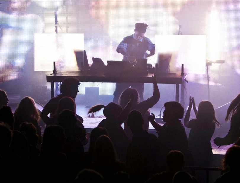
the_sixty_one_1

Menus are contextual, hidden, and modest; the focus is always on the experience of music. It’s very effective. I am not surprised, however, that university administrators have trouble with this design—what about all of those critical menus and submenus for students, faculty, staff, alumni, parents, visitors, news, views…? Of course, the design idea of a site like The Sixty One is to put engagement before information.

Universities have actually moved slightly in this direction in the past year; many of them now have a one-third slice of the screen devoted to rotating photographs: a scientist swirling blue liquid in a beaker, a string quartet bowing, a circle of students laughing on the grass. (Expect a greater rotational frequency for that classic last image, as it is the most effective anti-MOOC advertising imaginable.) But they still have all of those menus and submenus cluttering up the top and bottom, and news items running down the side, competing for attention. Information before engagement. The same is true for most cultural heritage institutions.

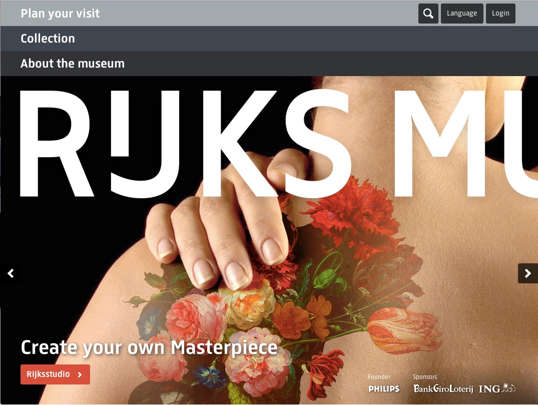
In a break from the normal this fall, the Rijksmuseum went all-in for The Sixty One’s philosophy in their site redesign, which fills the screen with a single image (albeit with a few key links tastefully striped across it):

As effective as it is, engagement-before-information can be an offputting design philosophy for those of us in the scholarly realm. The visual smacks of popularization, as opposed to textually rich, informationally dense designs. Yet we know that engagement can entice us to explore and discover. Home page designs like the Rijksmuseum’s should stimulate further discussion about a more visual mode for scholarly sites.

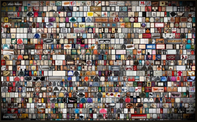
Take the standard online library catalog. (Please.) Most catalogs show textual search results with plenty of metadata but poor scannability. Full-screen visual browsing—especially using the principle of small multiples, or grids of images—can be very effective as a scholarly research aid, facilitating comparison, discovery, and serendipity.

Oddly enough, one of the first examples I know if this design concept for a research collection comes from the Hard Rock Cafe, which launched a site years ago to display thousands items from its memorabilia archive on a single screen. You can zoom in if something catches your eye—a guitar or handwritten lyrics.

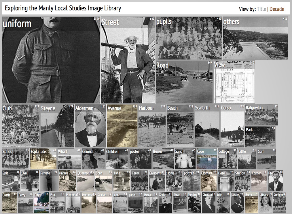
Mitchell Whitelaw of the University of Canberra has been experimenting with similar ideas on his Visible Archive blog. This interface for the Manly Library uses the National Library of Australia’s Trove API to find and display archival documents in a visual-first way:

The images on the search page are categorized by topic (or date) and rotate gently over time without the researcher having to click through ten-items-to-a-page, text-heavy search results. It’s far easier to happen upon items of interest.

Whitelaw has given this model a great name—a “generous interface“:

Collection interfaces dominated by search are stingy, or ungenerous: they don’t provide adequate context, and they demand the user make the first move. By contrast, there seems to be a move towards more open, exploratory and generous ways of presenting collections, building on familiar web conventions and extending them.

I can imagine generous interfaces working extremely well for many other university, library, and museum sites.

Update: Mitchell Whitelaw let me know about another good generous interface he has worked on, Trove Mosaic:

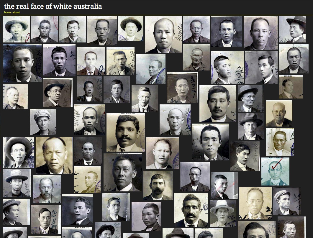
And I should have remembered Tim Sherratt’s “Faces” interface for Invisible Australians:

Trevor Owens connects the generous interface to recent commercial services such as Pinterest. (I would add Flickr’s 2012 redesign.) Thinking about how scholarly generous interfaces are like and unlike these popular websites is important.
Reading and Believing

Rather than focusing on a new technology or website in our year-end review on the Digital Campus podcast, I chose reading as the big story of 2011. Surely 2011 was the year that digital reading came of age, with iPad and Kindle sales skyrocketing, apps for reading flourishing, and sites for finding high-quality long-form writing proliferating. It was apropos that Alan Jacobs‘s wonderful book The Pleasures of Reading in an Age of Distraction was published in 2011.

Indeed, the relationship between reading and distraction was one of the things that caught my eye reading Daniel Kahneman‘s essential Thinking, Fast and Slow. Kahneman speaks of two systems in the mind—he eschews “intuition” and “reason” for the more neutral “System 1” and “System 2″—with the first making quick, unconscious assessments and the second engaging in much more studious, and laborious, calculations. Since our minds (like our bodies) are naturally lazy, we prefer to stick with System 1’s judgments as much as possible, unless jarred out of it into the grumpier System 2.

In the fifth chapter of Thinking, Fast and Slow, Kahneman addresses the act of reading, and the impulse—even in what is normally thought of as the most cerebral of human acts—to fall back on System 1, to associate the ease of reading with the truth of what is read:

How do you know that a statement is true? If it is strongly linked by logic or association to other beliefs or preferences you hold, or comes from a source you trust and like, you will feel a sense of cognitive ease. The trouble is that there may be other causes for your feeling of ease—including the quality of the font and the appealing rhythm of the prose—and you have no simple way of tracing your feelings to their source.

Thus the context writing exists in and other aspects unrelated to the actual content are critical to the reception that writing receives. In addition to studies on the effects of different fonts on credibility, Kahneman also cites experiments that show the importance of the quality of paper (for printed materials), of the contrast between a font and its background, and of the presence of distractions that reduce the cognitive ease of reading. In short, environments that make it easy to read also make it easy to believe what is being read. Perhaps the most unsettling aspect of this mixture of context and content is that is it extremely difficult for you to separate the two.

So legibility and the absence of distractions are not just design niceties; when a reader chooses to move an article into an app like Instapaper, they are strongly increasing the odds that they will like what they read and agree with it. And since readers often make that relocation at the recommendation of a trusted source, the written work is additionally “framed” as worthy even before the act of reading has begun.

Commercial publishers may not like the use of Instapaper or Readability, which strip the distractions otherwise known as ads from a cluttered website to focus solely on the text at hand, but they are an unalloyed good for writers.

Design Matters

One of the more uncomfortable truths about digital humanities—indeed, likely one of the reasons for resistance to digital humanities among traditional scholars—is that design matters. Those of us who have chosen the life of the mind like to think that ideas and insights will find an audience and make an impact regardless of such superficial things as the vehicle those ideas and insights are communicated through. Design also smacks of marketing, which most professors consider unseemly.

But good design for a website, service, or tool means, as Roy Rosenzweig and I put it in Digital History, that your resource will be useful and used. Useful because your resource will be structured in such a way that a user will be able to fully explore and learn from it; used because the user will be drawn into the resource and highlight its existence to others.

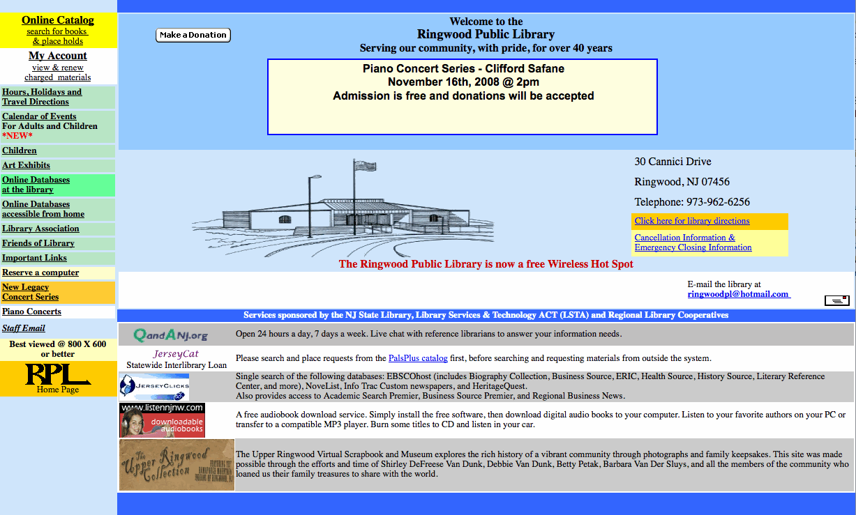
Case in point: Here is the website of the Ringwood (New Jersey) Public Library:

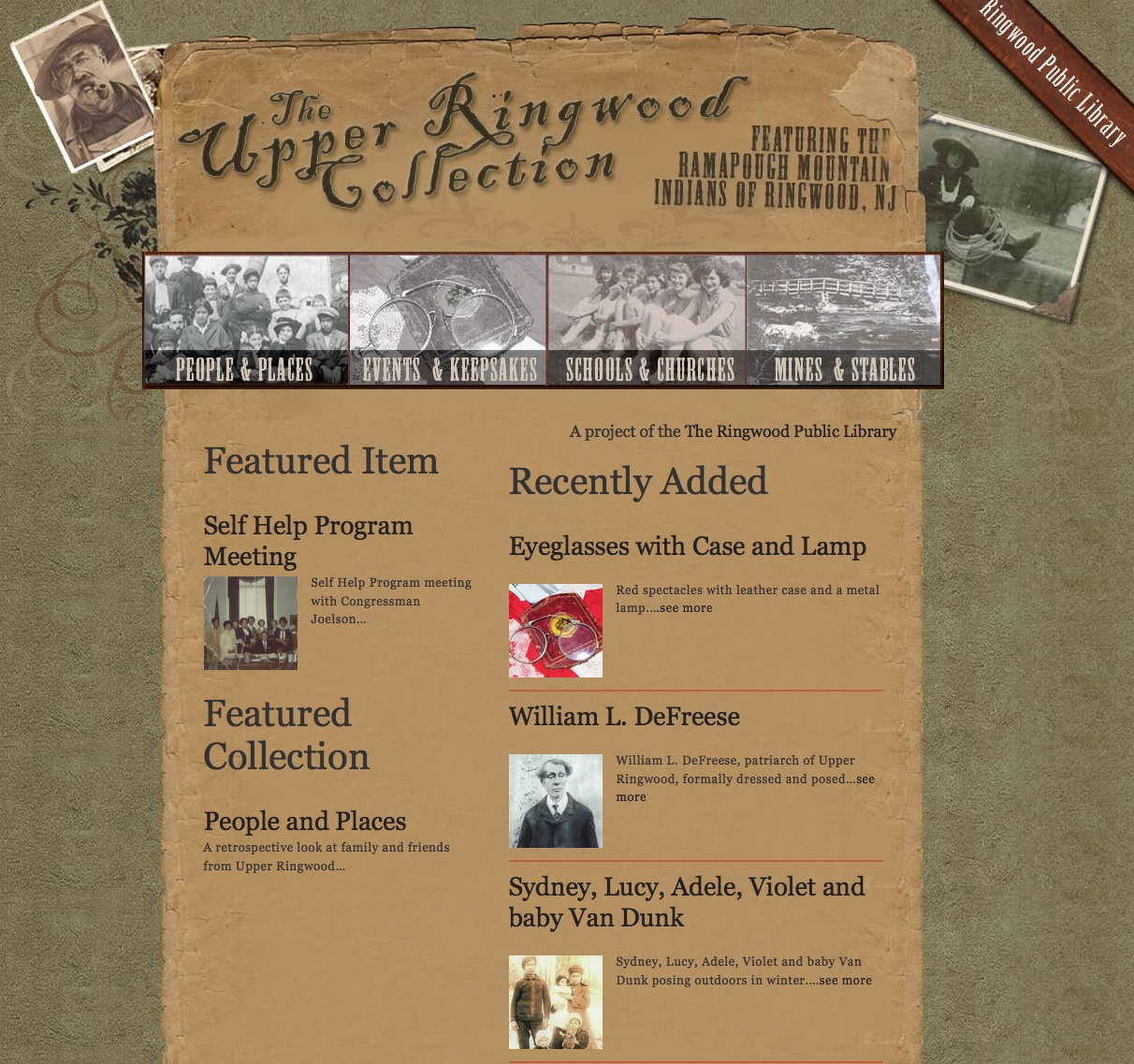
A not atypical website for a local public library. And here is the Ringwood Public Library’s site about the history of Upper Ringwood:

The latter is powered by Omeka. Which of these would you rather spend time with?

CHNM, Then and Now

Louis Rosenfeld, co-author of the enormously helpful Information Architecture for the World Wide Web, may be right—emotionally, at least—that “web redesign must die.” Anyone who has ever been involved with a redesign of a major website knows that it is a painful and long process, full of compromises.

But a redesign is often more than just a new coat of paint. It can be a time to reassess or reassert the mission of an institution, prioritize projects and features, and look to the future.

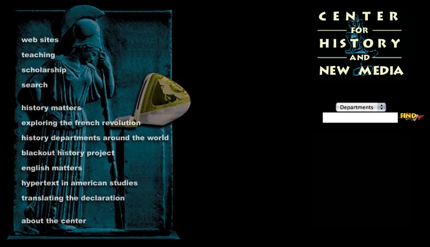
At the Center for History and New Media we have recently officially launched the fourth major design of our site in our fourteen-year history, thanks to the hard work of our design team, led by Jeremy Boggs, the information architecture and conceptualization led by Connie Sehat (who is now the Director of Digital Scholarship at Emory), and the oversight of CHNM’s Director of Public Projects, Sharon Leon. At the beginning of 2001, when I arrived at CHNM, our home page looked like this:

Since then we’ve grown ten-fold, adding dozens of employees and many new projects and initiatives, while going through a couple of site redesigns. We used to joke about having “divisions,” back when each employee was their own “division”; now we truly have divisions, i.e., units focusing on education, public history and collections, and research, scholarship, and software, although staff often float between these areas. Our latest design reflects this more lucid view of our own organization, and tries to better project all of the things going on under our roof without seeming cluttered:

I’m not looking forward to the next redesign. But now that it’s done, I’m really glad we did this one.

Boggs on the Digital Humanities Design and Development Process

It’s time to subscribe to the blog of CHNM‘s Creative Lead, Jeremy Boggs, if you haven’t done so already. Jeremy is ramping up for what promises to be a very important blog series on how to create and execute a digital humanities project, from conception to design to coding to maintenance.

Using AJAX Wisely

Since its name was coined on February 18, 2005, AJAX (for Asynchronous JavaScript and XML) has been a much-discussed new web technology. For those not involved in web production, essentially AJAX is a method for dynamically changing parts of a web page without reloading the entire thing; like other dynamic technologies such as Flash, it makes the web browser seem more like a desktop application than a passive window for reading documents. Unlike Flash, however, AJAX applications have generally focused less on interactive graphics (and the often cartoony elements that are now associated with Flash) and more on advanced presentation of text and data, making it attractive to those in academia, libraries, and museums. It’s easy to imagine, for instance, an AJAX-based online library catalog that would allow for an easy refinement of a book search (reordering or adding new possibilities) without a new query submission for each iteration. Despite such promise, or perhaps because of the natural lag between commercial and noncommercial implementations of web technologies, AJAX has not been widely used in academia. That’s fine. Unlike the dot-coms, we should first be asking: What are appropriate uses for AJAX?

As with all technologies, it’s important that AJAX be used in a way that advances the pedagogical, archival, or analytical goals of a project, and with a recognition of its advantages and disadvantages. Such sober assessment is often difficult, however, in the face of hype. Let me put one prick in the AJAX bubble, though, which can help us orient the technology properly: AJAX often scrubs away useful URLs—the critical web addresses students, teachers, and scholars rely on to find and cite web pages and digital objects. For some, the ability to reference documents accurately over time is less of a concern compared to functionality and fancy design—but the lack of URLs for specific “documents” (in the broad sense of the word) on some AJAX sites make it troubling for academic use. Brewster Kahle, the founder of the Internet Archive, surmised that his archive may hold the blog of a future president; if she’s using some of the latest AJAX-based websites, we historians will have a very hard time finding her early thoughts because they won’t have a fixed (and indexable) address.

If not implemented carefully, AJAX (like Flash) could end up like the lamentable 1990s web technology “frames,” which could, for instance, hide the exact address of a scanned medieval folio in a window distinct from the site’s navigation, as in the Koninklijke Bibliotheek’s Medieval Illuminated Manuscripts site—watch how the URL at the top of your browser never changes as you click on different folios, frustrating anyone who wants to reference a specific page. Accurate citations are a core requirement for academic work. We need to be able to reference URLs that aren’t simply a constantly changing, fluid environment.

At the Center for History and New Media, our fantastic web developers Jim Safley and Nate Agrin have implemented AJAX in the right way, I believe, for our Hurricane Digital Memory Bank. In prior projects that gathered recollections and digital objects like photographs for future researchers, such as the September 11 Digital Archive, we worried about making the contribution form too long. We wanted as many people as possible to contribute, but we also knew that itchy web surfers are often put off by multi-page forms to fill out.

Jim and Nate solved this tension brilliantly by making the contribution form for the Hurricane Digital Memory Bank dynamic using AJAX. The form is relatively short but certain sections can change or expand to accept different kinds of objects, text, or geographical information depending on the interactions of the user with the form and accompanying map. It is simultaneously rich and unimposing. When you click on a link that says “Provide More Information” a new section of the form extends beyond the original.

Once a contribution has been accepted, however, it’s assigned a useful, permanent web address that can be referenced easily. Each digital object in the archive, from video to audio to text, has its own unique identifier, which is made explicit at the bottom of the window for that object (e.g., “Cite as: Object #139, Hurricane Digital Memory Bank: Preserving the Stories of Katrina, Rita, and Wilma, 17 November 2005, <http://www.hurricanearchive.org/details.php?id=139>”).

AJAX will likely have a place in academic digital projects—just a more narrow place than out on the wild web.

An Actual Use for Windows on the Mac

OK, so you can now run Windows on a Mac. So what? For most of us in the humanities, all we need is already on the Mac, which (in addition to intangibles such as the Mac’s design) is why so many of us remain stubbornly attached to Apple’s computers while over the last twenty years almost everyone else has moved to the more generic platform of the PC. Most educational, graphics, and web development software is available for the Mac. (For those in the social and natural sciences, on the other hand, many important software packages are either not available for the Mac or come out later than they do for the PC.) But perhaps there’s the rub. Since many of us only use Macs—especially those that build academic or museum websites—we often don’t see how most people view our sites. Since websites often render differently on different operating systems and web browsers, not checking how your site will look (and perform, if you are using dynamic web technologies) on a PC with IE (still 85% of web surfers) is unwise. Now with Parallels Workstation—the Windows-on-Mac solution that doesn’t require rebooting your computer to switch OSes—you can literally have a window into the world of Windows sitting on your desktop in parallel with your Mac applications. For instance, here’s a screenshot of my Mac desktop with Firefox for the Mac running on the left, and IE for Windows running on the right:

Looks to me like I need to work on the font size differential between Macs and PCs.

This parallelism of operating systems is incredibly handy for web development on a single machine. At the Center for History and New Media we have gone through phrases where we have paid for services that send us static images of our websites on different platforms and in different browsers. We also spend a lot of time running from our Macs over to PCs to check how everything is looking. Now we can do this all on one machine, easily and instantaneously.

Now I just need to install another window for the 2% of web surfers using Linux…

Doing Digital History June 2006 Workshop

If your work deals in some way with the history of science, technology, or industry, and you would like to learn how to create online history projects, the Echo Project at the Center for History and New Media is running another one of our free, week-long workshops. The workshop covers the theory and practice of digital history; the ways that digital technologies can facilitate the research, teaching, writing and presentation of history; genres of online history; website infrastructure and design; document digitization; the process of identifying and building online history audiences; and issues of copyright and preservation.

As one of the teachers for this workshop, I can say somewhat immodestly that it’s really a great way to get up to speed on the many (sometimes complicated) elements necessary for website development. Unfortunately space is limited, so be sure to apply online by March 10, 2006. The workshop will take place from June 12-16, 2006, at George Mason University’s Arlington campus, right outside of Washington, DC. It is co-sponsored by the American Historical Association and the National History Center, and funded by the Alfred P. Sloan Foundation. There is no registration fee, and a limited number of fellowships are available to defray the costs of travel and lodging for graduate students and young scholars. Hope to see you there!